Understand the dashboard
See at a glance what moves your business forward.
The dashboard summarizes commerce performance for the selected stores and period. Use it to spot a change, then open the relevant detailed report to explain it.
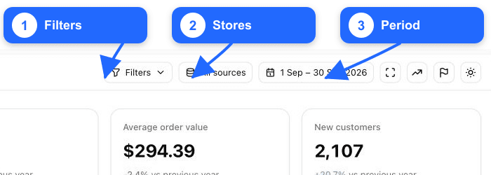
1. Set the scope
The controls at the top apply to the dashboard:
- Filters narrows the analysed population with supported report filters or a saved segment.
- All sources selects one or more connected stores. Totals combine only the selected sources.
- The date range controls the current period and its comparison period.
Always record these three values when sharing a number. Two people can see different totals if their store scope or filters differ.
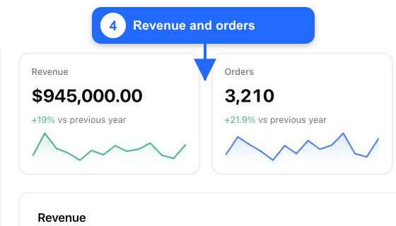
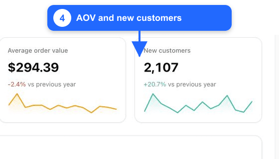
2. Read the four KPIs
| KPI | What it answers |
|---|---|
| Revenue | How much commerce revenue was recorded in the selected scope and period? |
| Orders | How many orders contribute to that revenue? |
| Average order value | How much revenue does an order generate on average? |
| New customers | How many customers placed their first recognised order in the period? |
Each card includes a small trend and a comparison percentage. A positive percentage means the current value is higher than the comparison period; it is not automatically good or bad. For example, lower revenue is negative, while a lower cost may be favourable.
Comparison context matters
Check whether the dashboard compares with the previous period or previous year before explaining a percentage. Seasonality can make a year-over-year comparison more useful than the immediately preceding days.
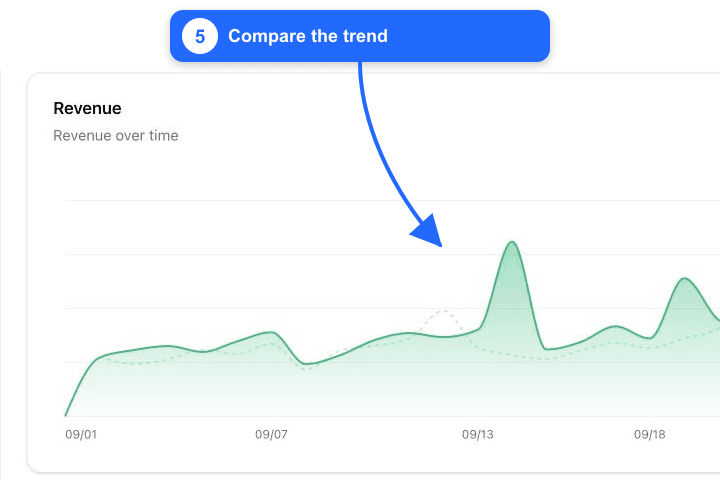
3. Follow the trend
The solid line represents the selected period. When available, the lighter dotted line represents the comparison period aligned by day. Hover a point to read the exact current and comparison values.
Use the chart to locate the day that created a change. Then ask what changed at the same time: campaign launch, stockout, promotion, tracking interruption, refund batch, or store incident.
4. Use the rest of the dashboard
Scroll down to compare order and new-customer trends and to review top products and categories. These rankings are starting points, not conclusions: open the linked product, category, order, or customer report before taking action.
The header also provides shortcuts for full-screen or TV mode, trend display, annotations, and theme where available. Annotations are useful for recording events that explain a spike or drop.
A reliable review routine
- Confirm store scope, filters, date range, and comparison.
- Identify the KPI with the material change.
- Locate the affected days on the trend.
- Open the matching detailed report.
- Record the context and decision, not just the number.
Tip
Start with a wider period to see the pattern, then narrow the dates to the days that explain the variation. Avoid choosing the dates only after seeing the result you want.
Continue with Your first report.